Figma-Webflow Component Library
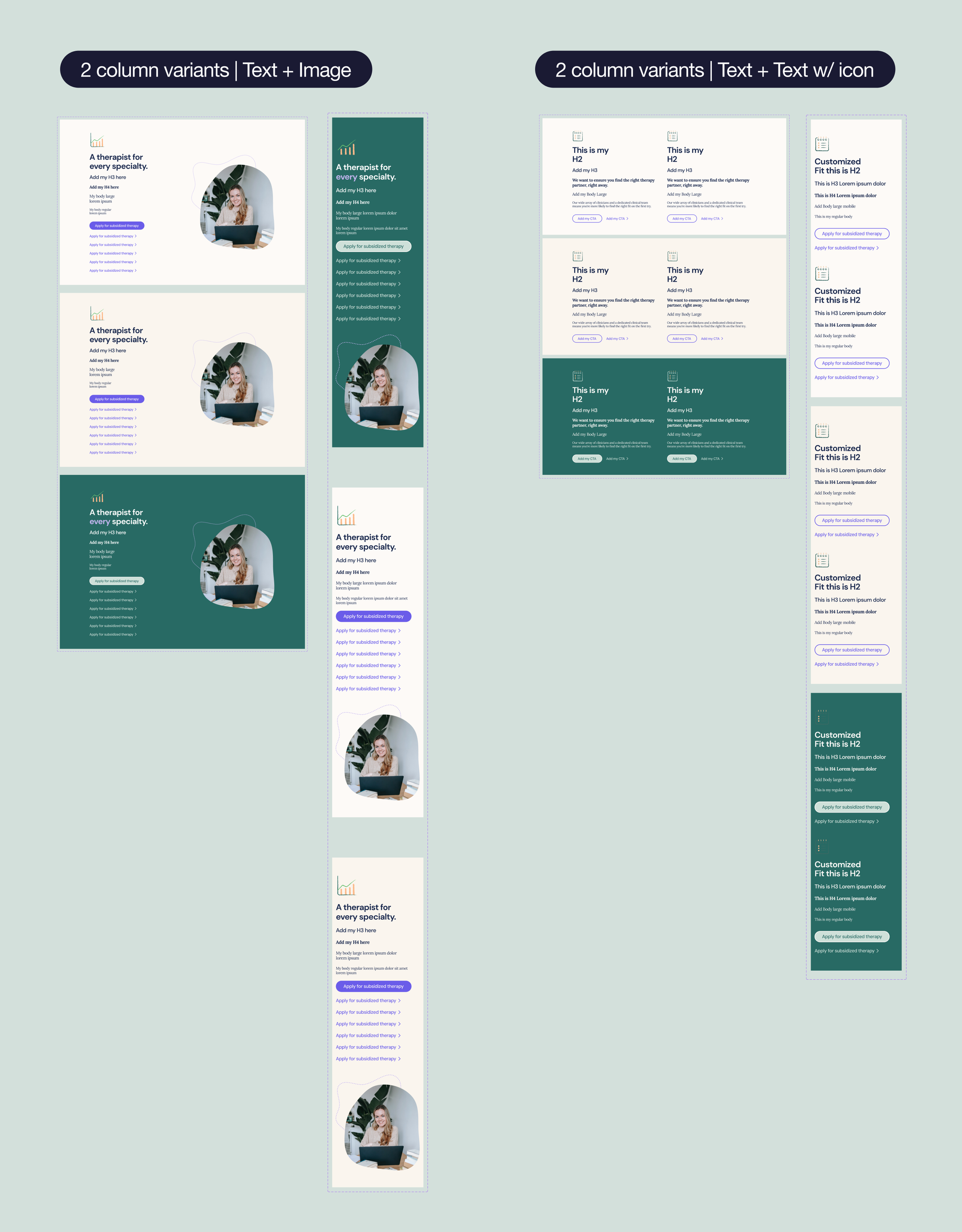
As part of our initiative to both redesign the entire Resilience Lab website and migrate from the existing Wordpress to a new platform, we decided on Webflow for its ease of spinning up various new pages seamlessly once the modular system was designed. The modular system refers to various components suppporting many different types of content due to the use of Figma’s variants. Figma’s variants also ensured a 1:1 common language between design and our developer partners for speed and efficiency.
Elements within components can be removed without impacting the architecture of the parent component (i.e. CTAs, icons, text). Each component was designed to include every element that would lead to every possible permutation of the component, keeping in mind the possibility of subtracting these elements in each new use case.
Using
components
Whether you’re a designer using these component variables in Figma, or a marketer creating a page in Webflow’s CMS, simply mix and match.